I am trying to use Sleep for Android as my primary night clock but there are a few critical features missing from the app I am currently using.
- Changing the color of the night clock display to other colors .
- Pinching to zoom the night clock for larger or smaller clock font.
- Adjusting brightness / dimming of the night clock to a very dim clock display (similar to your default dimming level or less) to a brighter clock display as desired.
- Addition - I forgot to check this and your app may already do this - rotating the night clock from portrait to landscape depending on the orientation of the phone, with the clock filling most of the screen in landscape mode.
support conversation with Johnny
1 Like
I really like the app as a sleep tracker, but I hate it as an alarm clock. The interface that pops up when the alarm rings is just overcrowded with buttons and as I am myopic I have to really concentrate to tap the right button. Please simplify it, maybe take inspiration from google clock which I find much more usable. Or at least let me choose how many buttons to show on the screen.
Change the position of the buttons on the alarm screen to prevent display burn.
support conversation
Hi @lenka-urbandroid,
This is a good feature request.
I avoid this risk currently by using a clock app that moves its display. It also integrates with the device’s alarm clock for ease of setting it.
https://play.google.com/store/apps/details?id=de.andreas1724.bigdigitalclock
I would love to see an option for the snooze/dismiss alarm screen that looks like the official Google clock, ie a swipe up/down or left/right to snooze and dismiss
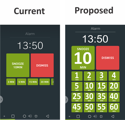
On the alarm screen, I can’t read (without glasses when I’ve just woken) the sleep time in the snooze button box or the times in the additional smaller snooze buttons. Also, the need to scroll to get to additional snooze times requires too much thought when you’re trying to stay sleepy.
I’d like to see the font size of all the times much larger and the scrolling replaced by a grid instead. An example is attached. Note: I have a vector version of the sample, but it won’t let me upload it.
Cheers,
Matt
1 Like
I really like the app as a sleep tracker, but I hate it as an alarm clock. The interface that pops up when the alarm rings is just overcrowded with buttons and as I am myopic I have to really concentrate to tap the right button. Please simplify it, maybe take inspiration from google clock which I find much more usable. Or at least let me choose how many buttons to show on the screen.
2 Likes
It would be ideal for me if the screen did not turn on with an alarm clock, to turn it off, first press the lock button.
support conversation with Дмитрий
1 Like
Add an option to dim the alarm screen.
support conversation with Павел
1 Like
I just started using Sleep as Android after a few years away from it and it’s shocking how bright the alarm screen is. There’s no option to dim it?
Hi @bryciferal,
is it possible the alarm sun-rise effect using the backlight is enabled? This feature creates a sun-rise effect without smart lights by using the phone’s screen. It will gradually turn on brighness as the alarm progresses.
Without this feature, the alarm screen stays black.
Check Settings > Alarms > Gentle wake-up > Sunrise wake up.
