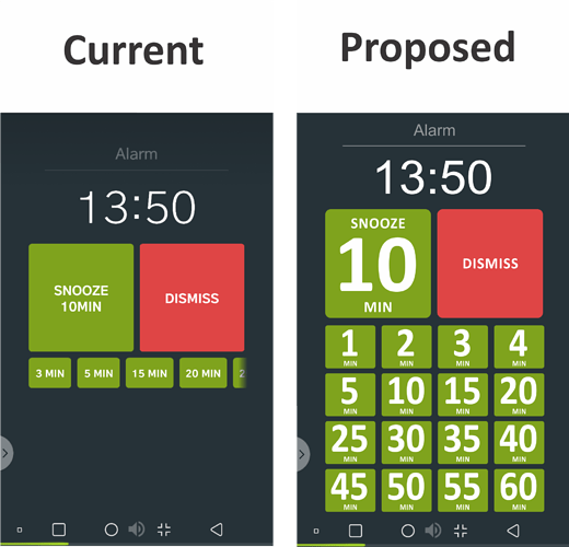
On the alarm screen, I can’t read (without glasses when I’ve just woken) the sleep time in the snooze button box or the times in the additional smaller snooze buttons. Also, the need to scroll to get to additional snooze times requires too much thought when you’re trying to stay sleepy.
I’d like to see the font size of all the times much larger and the scrolling replaced by a grid instead. An example is attached. Note: I have a vector version of the sample, but it won’t let me upload it.
Cheers,
Matt
