Love this app, but I have one primary issue…
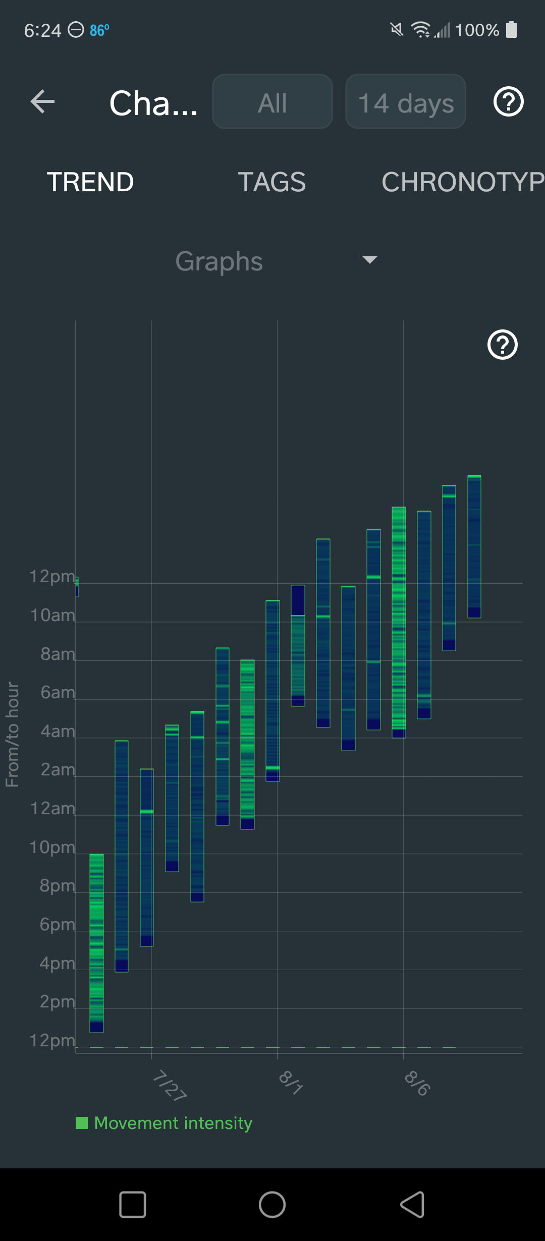
The Trends > Graph is hard to read because the sleep period stays in one solid bar and goes beyond the graphing area. Is this something that might be improved in future?
Current Example:
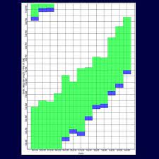
Example of Readable Graph:
Thank you! Your app makes my life so much easier.
I apologize if this topic already exists; I searched but didn’t find this request.
Many thanks, I’m putting this to our TODO list..
4 Likes
Thank you so much! I look forward to the update. This application truly makes my life so much better. Everything you all do means a lot to me! Cheers
1 Like
@LibertyNon24 very much appeacited! Many thanks
2 Likes
Made an account for this!
As an irregular sleeper (delayed sleep phase), it’s an important part of the tracking.
Just “simply” adjusting the graph area to be the earliest sleep and latest wake time of the chosen period would be amazing 
2 Likes
Bump
2.5 year later, would still really love this feature/fix! Thank you so much.
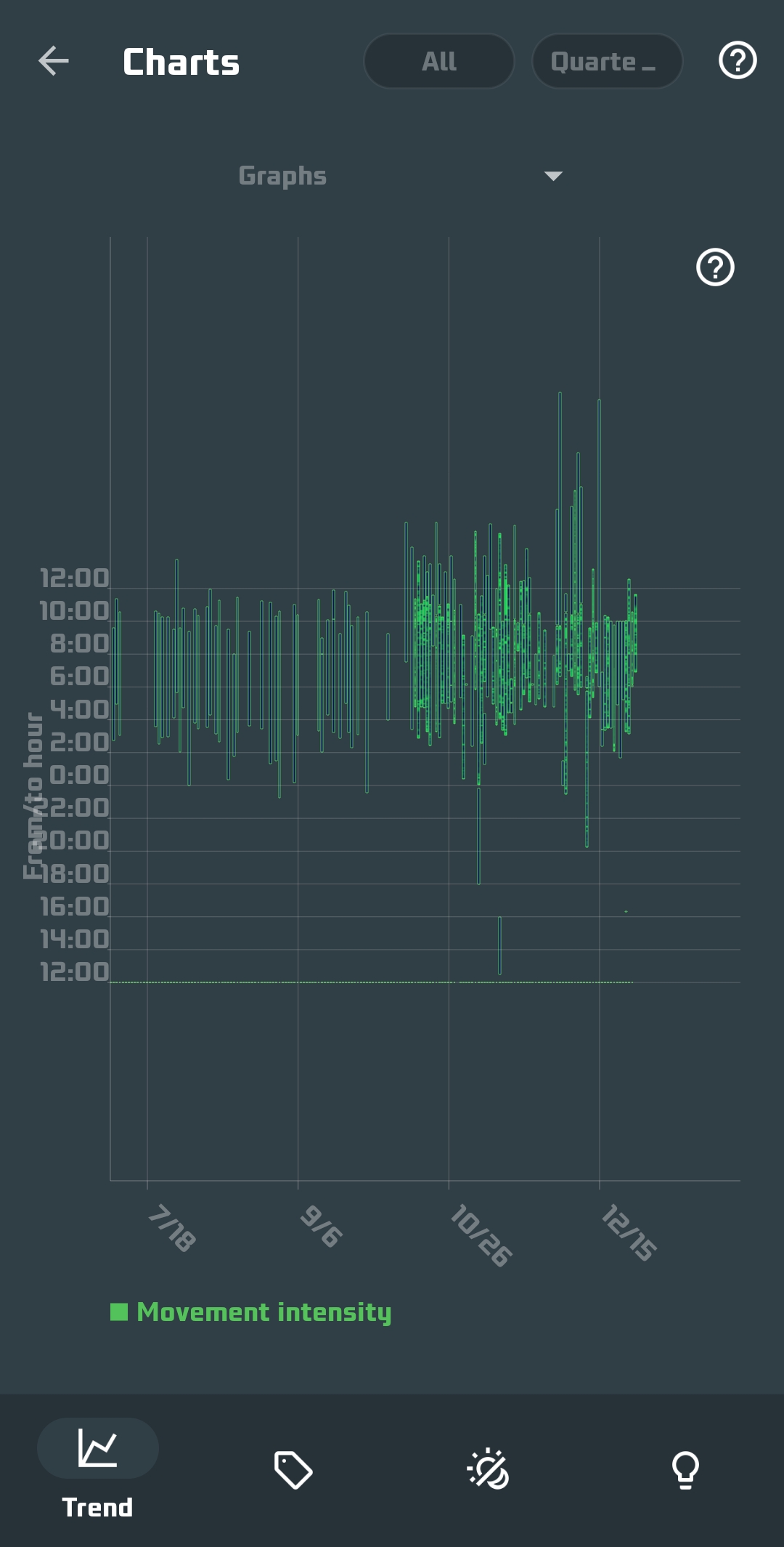
Hi, I was hoping for an update about the actigraph chart. I recently noticed the horizontal bars are gone, making it even more difficult to read. Myself and many others with Non-24 use this app specifically for actigraph sleep chart logs, which we often need to present to doctors. Would it be possible to get a more accurate actigraph that stays within the bounds of a graph?
Thank you,
Liberty