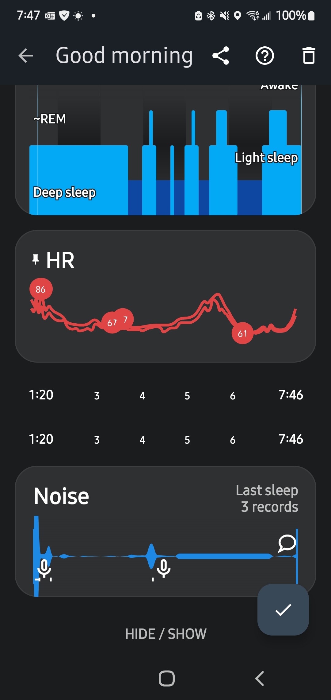
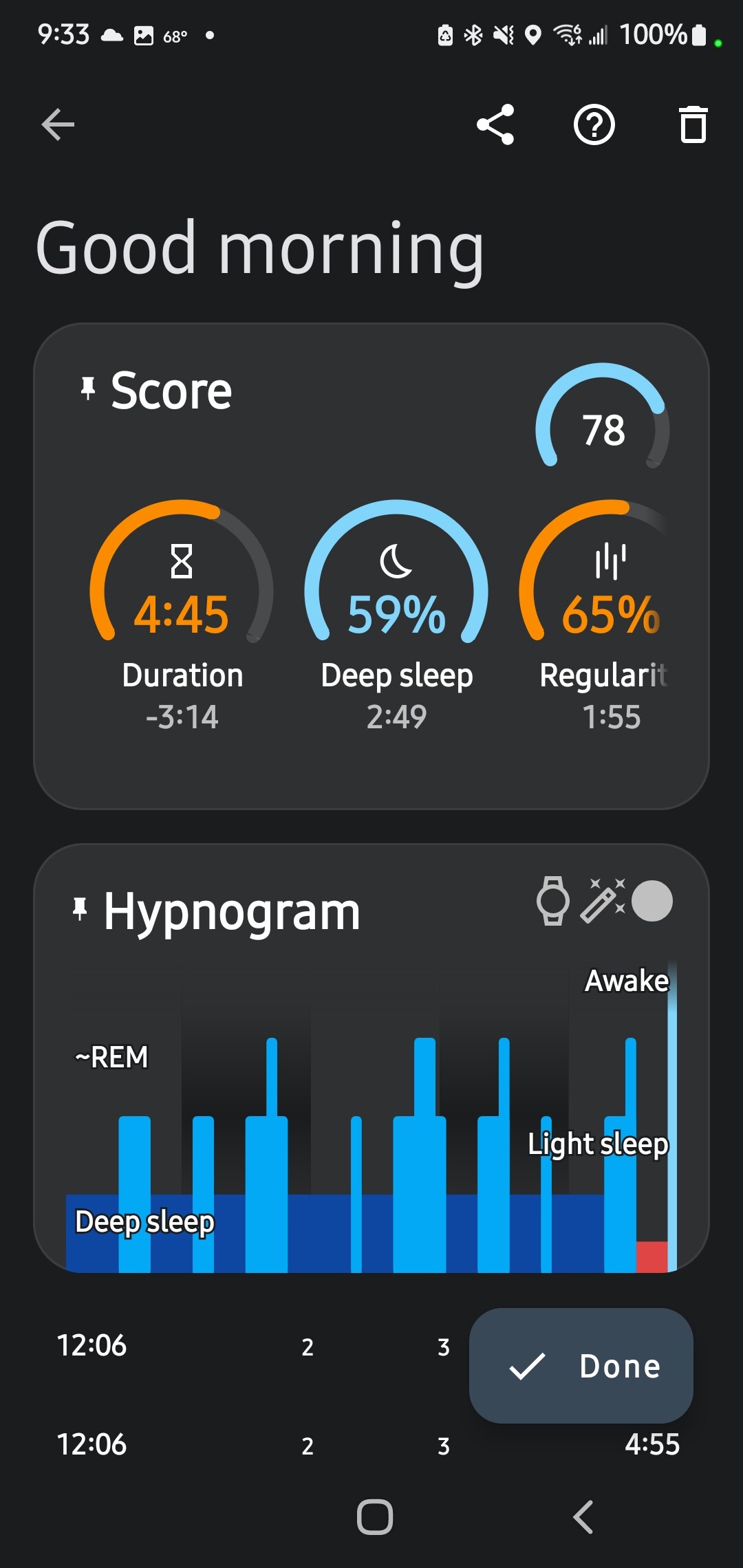
Strange summary this morning. Haven’t seen this happen before. I didn’t see this reported before, searched a few terms.
Hi @Cocokola, if you close the graph and open it again, is the graph rendered properly?
Many thanks, it seems the timeline got duplicated, I did not yet see this, any hints on how to reproduce would help. If you can reproduce a problem you can consider it fixed :)..
1 Like
It seems to be a one-off. It’s the first time since ~2013 I’ve seen this.
I’ll try to see if i can recreate it. Only thing i can think of was that night i paused often due to insomnia, but that isn’t anything new either. Love the app, I’ve enjoyed watching it “grow up”,
Cheers!
It was the wake up summary where you can edit things. I haven’t run across a way to get back to that. I’ll double check though.
Big thanks for your support! very much appreciated, I would expect this to be related to pinning/unpinning of cards .. I will try to reproduce..
1 Like
I may have pressed hide by mistake and unhid, but I believe this screen happened on a day were I hit pause many times.
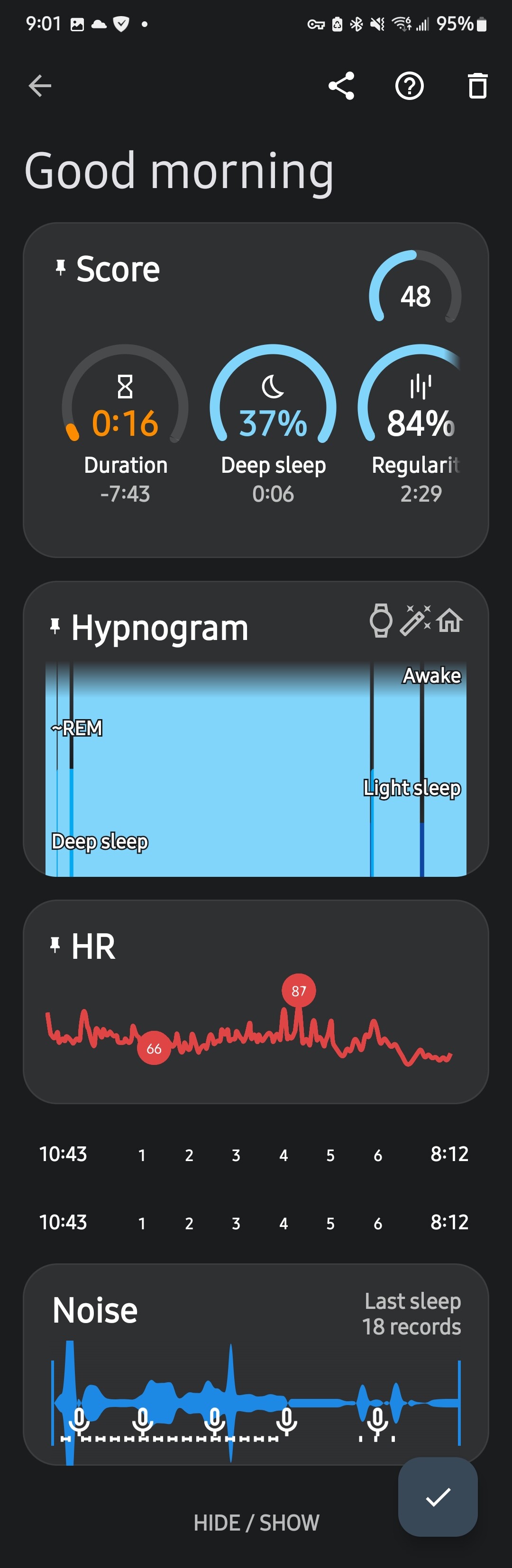
Ready for a plot twist? ![]()
![]()
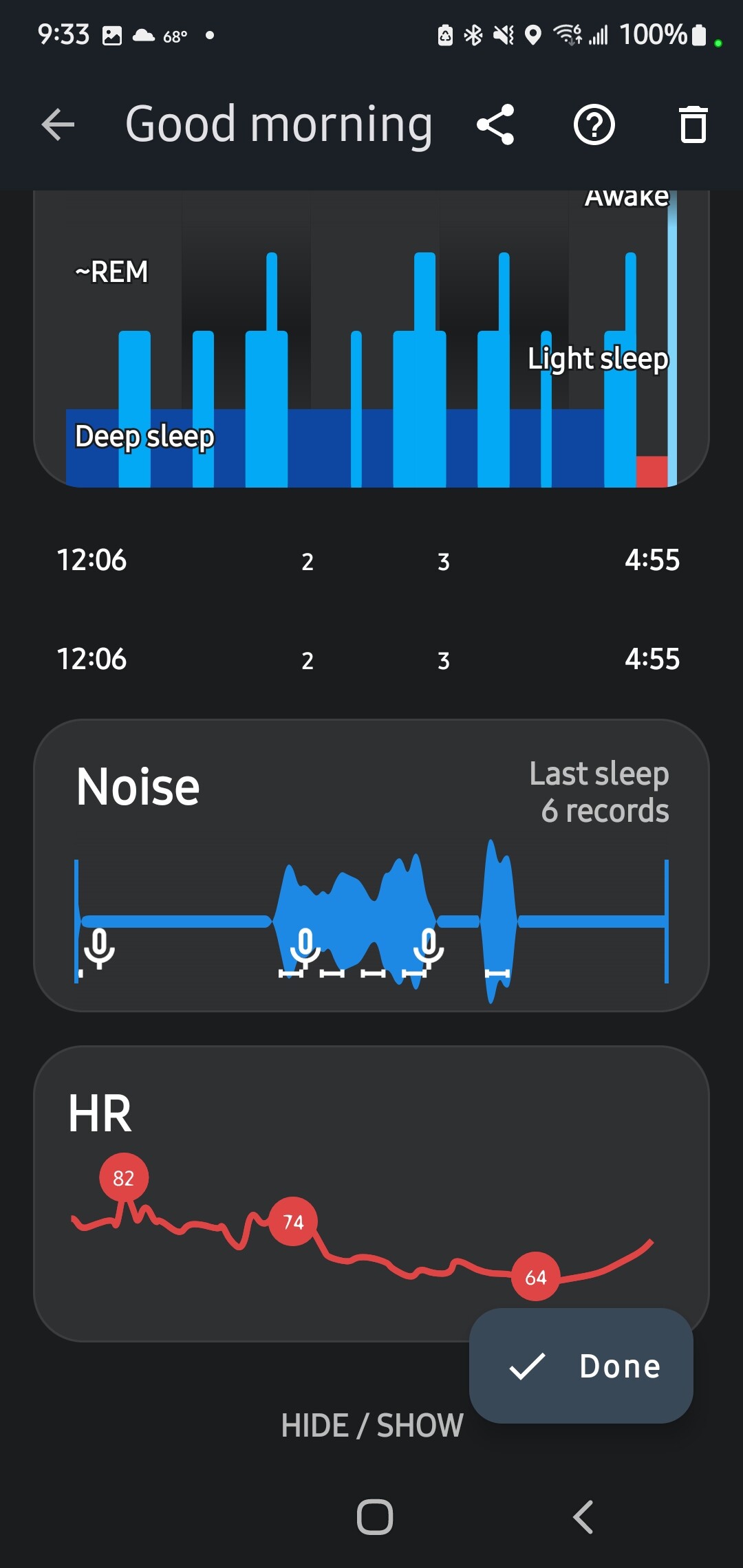
The hours below heart rates is doubled. This happened without any hide/unhide..
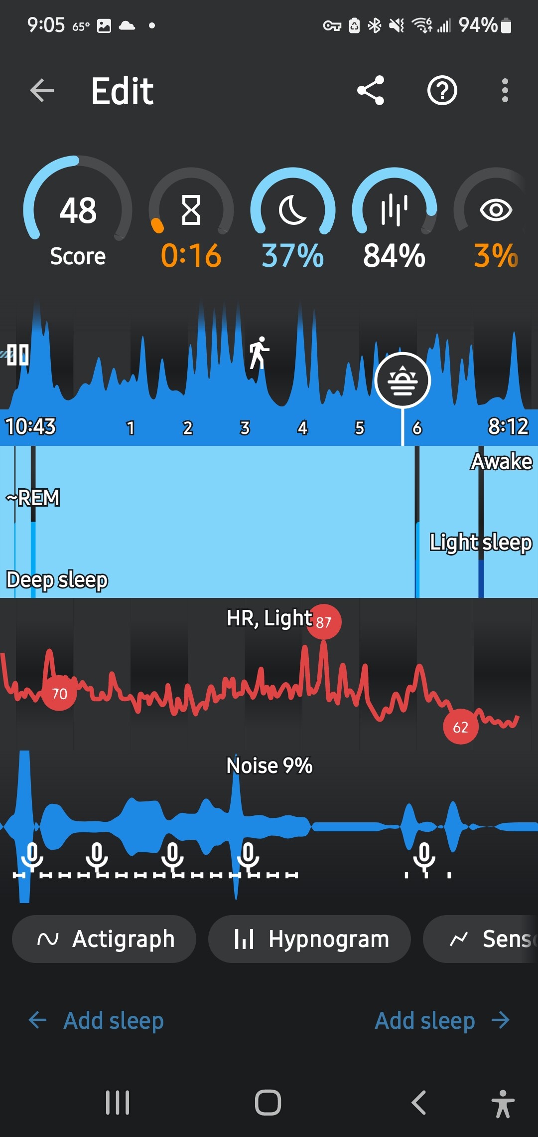
I started the trace manually, hit pause 4 times.
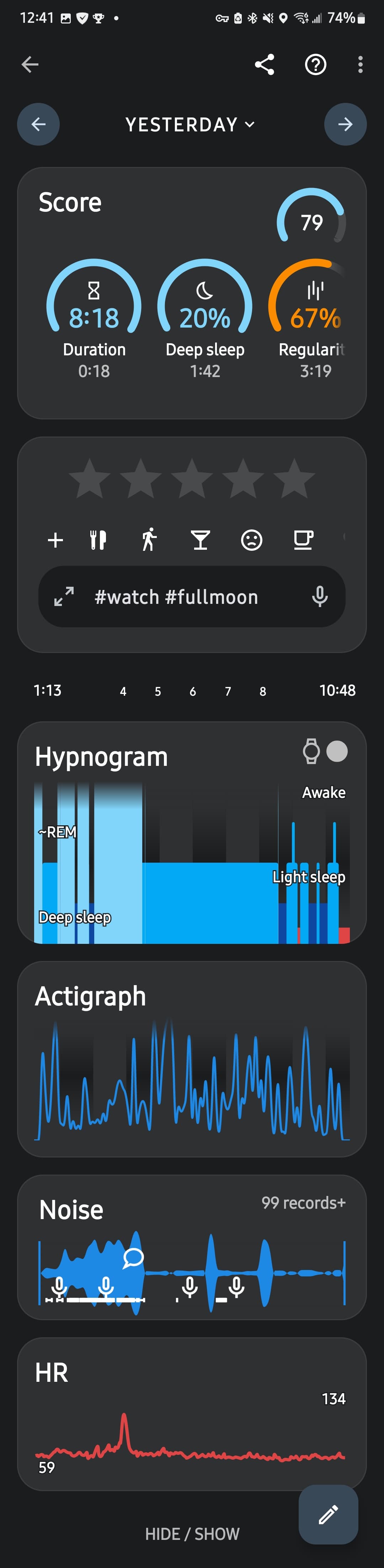
Stranger still is it shows the entire sleep time, but you can see it incorrectly captured the stages of sleep. This was the first good sleep i had in weeks, I’m trying to adjust my inspire sleep implant, oh well.
I think you have a report problem that uploads data if my memory is still intact.. I’ll try to upload data.
Also, First time i used widget to start my sleep tracking because i suspect it wasn’t catching my start time did to 12 years of not getting to sleep until much later
The paused tracking does not collect data - on your screenshot, only the very beginning of the tracking was paused. The rest of the graph is covered with some awake. From how it looks like, it might be “awake when using phone”. Could you please use the Left ≡ menu → (?) Support → Report a bug and send me your logs? I will check, which type of awake sensitivity needs to be lowered.
You can revert the awakes estimated by the app - tap the (⁝) menu in the top right corner → Delete awake. Since the tracking was running and has data, the app will recalculate the results.
1 Like
Thanks for the info. I sent two bug reports, one yesterday for two days ago, and again today
So some of the following I’m curious, I’m also thinking of ways to possibly improve, so forgive me in advance. I’m not being critical.
I did find on my phone somehow the battery optimization was somehow charged from unrestricted, so I set that back i don’t think that was the cause because the audio was still recorded.
My watch was still running the sleep app, and I verified that the battery condition was set properly.
I didn’t wake up, nor use my phone (maybe my wife did?) during this time.. so if you can figure out what threshold was exceeded that will help.
If it was a threshold exceed /pause recording, why would audio still be tracked? Why wouldn’t you set the graph to indicate which threshold triggered the pause so users and you don’t have to submit a report to find out?
Cheers!
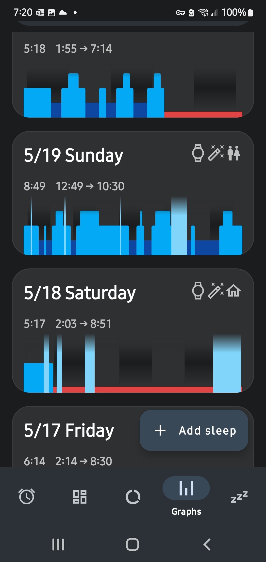
It’s happening again. I slept until 830am. I moved my phone to check the time at some point during the night, not sure why it shows red /disconnected to my Samsung watch Pro 5 again. It doesn’t keep tracking until I work up either.
I’ll check my ‘detect activity’ sensitivities to see if that is related. I’ll send a hug report again, hope it helps.
Thanks!
I reread the documentation on sleep awake detection. I turned the use phone down to low from high, that might be why it stopped tracking. I thought these sensitivities were for marking the graph instead of stopping the sleep period.
This still doesn’t explain the red sections that started happening recently does it?
The awake sliders only apply to the graphs’ awakes.
The automatic tracking has its own awake detection. To end the tracking, it must be some really prominent tracking around the time you either usually wake up, or around the time you reach the target.
And there seems to be some awake detected - since the app does not have the movement data, it must be one of the other awake class. Do you have the light level data?
The red sections are most probably some battery optimization, which breaks the communication. I have a few reports from Galaxy Watches showing the same strange red sections at the very end of the tracking. No other wearable using the same addon has this trouble, only Galaxy Watches, and not all users experience it. When we tried to catch this in the act on our wearable, it has never happened when the wearable was hooked on the debugging software (probably it prevents the optimization from kicking in). Would it make any difference, if you keep the phone on the charger for a test?
Or do you see any pattern between the nights where you have the red sections, and where you have the full graph?
Yeah, I thought of that, think I mentioned it in my first post?
I’ve checked the battery optimizations on both the watch and phone app before posting. The red still happened. Looking at the icons on the summary by day data,
Docs say “Red sections on your graph indicate that the app did not receive data from sensors at that time. This usually happens when using wearables due to lost connection to the wearable. The phone’s accelerometer can also (very rarely) malfunction”
.. Perhaps a battery going dead would have it go red and stay red, but I had three sleep captures above that didn’t stay red.
Perhaps it was a lost connection, despite it being two feet away? I dunno i sent logs for developer to check .
Still not sure why the hours get shown twice on summary screen.
Thanks all for your help figuring this slall out.
I haven’t seen a pattern. I always plug in my phone for sleep and my watch is charged prior to every sleep.
If you look at this nights sleep, there are two drop-outs. The heart rate is recorded from the same watch, i think the action graph is from the watch accellometers as well (my phone is on a table or the floor if i happen to leave it on the bed earlier in the night)
So it doesn’t quite make sense that it is a thread lock/hold due to it not being active app.. although these data points are from same Device doesn’t mean it is the same api or thread.
I’m open to testing with you, maybe we can at least narrow down what it isn’t?
I do beta testing for several companies, i used to be a QA manager for developmed software, my expertise is with Windows, but I’m versed in other OS.
Thoughts?
The low battery would show on the graph as an icon (for the phone’s battery). Do you see a very low battery on the wearable in the morning?
The lost connection might have been a trouble, but most users keep the phone really close. So possible a battery optimization applied to the BT?
But that still does not explain, why it happens only in the very end of the tracking, and only on GW platform.
We suspect some optimization without the users’ interface on the wearable. But it seems to be linked to the phone activity - one user got rid of the red sections completley, when he started charging the phone…
The timeline can show twice, if you have some cards pinned. We will try to come with a better solution.
Thanks for your guidance. The problem has resolved on is own. I’ve had great data since this last post i got covid for 4th time, so apologies for the late reply.
I’ll repost if something happens again
Cheers and thank you
![]() great news
great news
Sorry to hear you had Covid, hope you are feeling better!