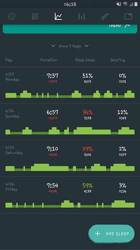
I think this floating button “+ add sleep” is intrusive and it blocks the view from the dashboard. Sometimes it does get smaller with just a “+” symbol but still is intrusive and blocks the information that I am trying to see.
Or maybe you can keep the floating button, but make a further scroll down a bit further so the button doesn’t cover the graph; like this:
from support conversation with Oscar
