Don’t even know what to look for etc. I still don’t see my sp02 I was wearing a Welleu ring and had vihealth running. When I clicked on start sleeping it connected to the ring and stopped when I woke up. Still missing data. I’m so confused.

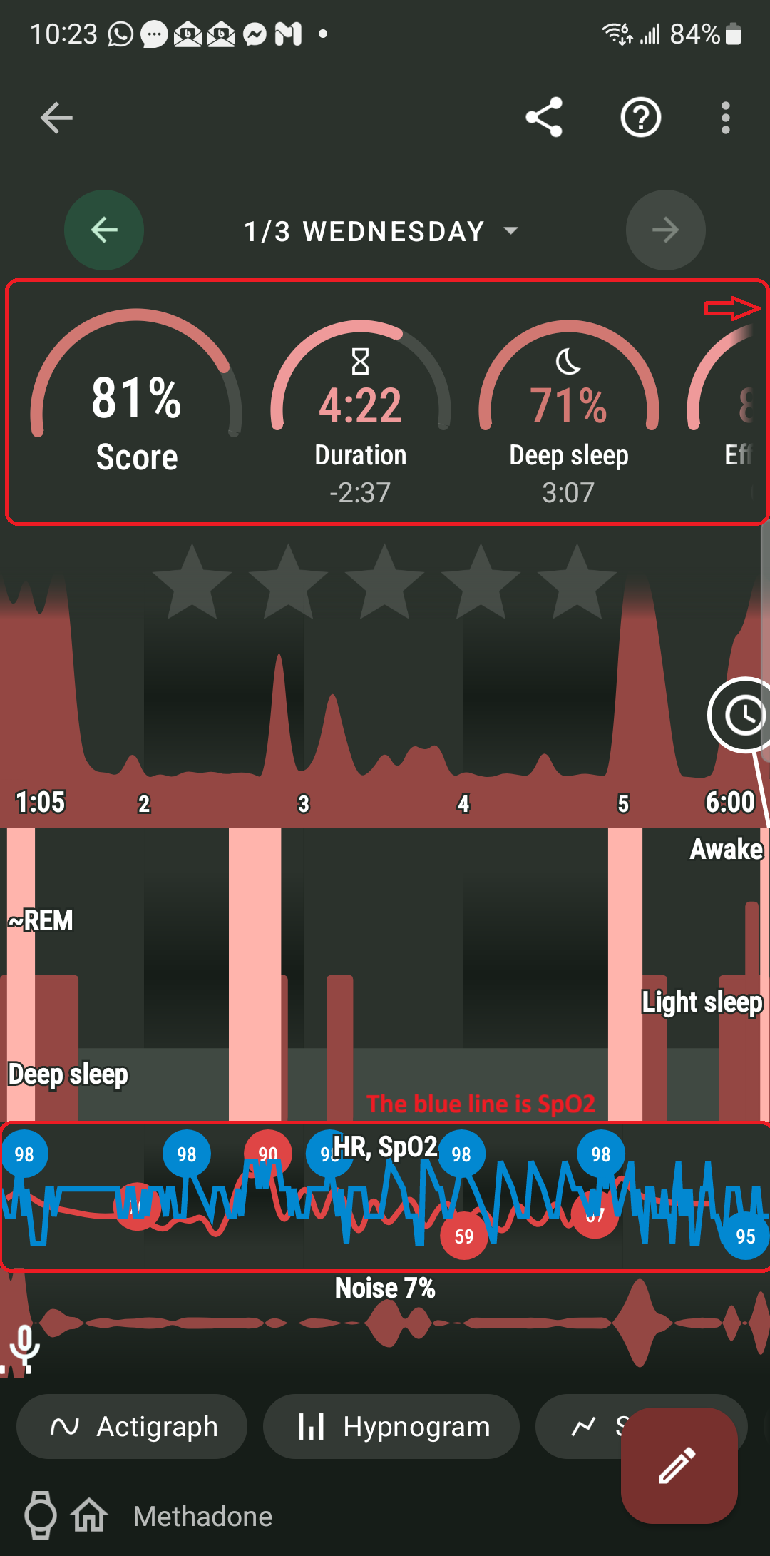
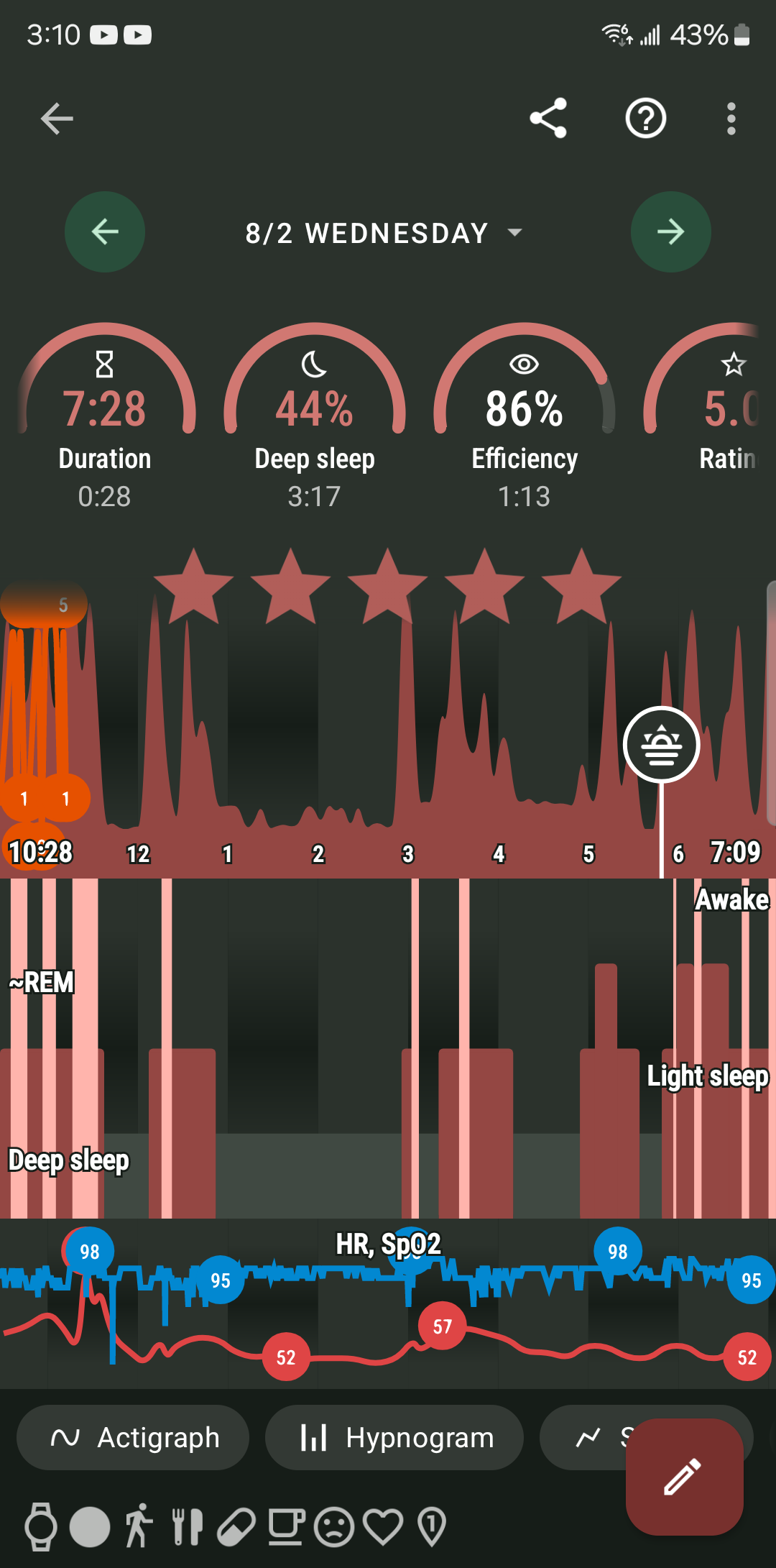
Hello Vaco, the blue line is SpO2 level (below the sleep phases, above the noise chart).
The “Breath” sleepscore chart only shows, if you have a breathing disturbance. If you scroll the sleepscore section - is there the pie chart labeled “Breath”?
Also as soon as I turn the sleep tracker an annoying ( notification type ) noise goes unstopped. I can’t find where to silence that constant noise. It sounds like if you were receiving a notification. Had to turn the volume all the way down to sleep. Never had that before
Hello? Im left by myself wondering? It’s ANNOYING
Hello Vako, please, check my reply above (sent approximately 11 hours ago). In short - you have SpO2 data on the graph you posted, it is the blue line in the sensor section.
Regarding the sound - there are a few features in the app, that produce sounds, but none of them are enabled by default. Could you please share the recording of the sound you hear? No one else reported issues with a sound when tracking with the wearable device.
So why is this app giving different stuff every night I use it? 1 night gives me a set of stats, next day a different set, next another different? What’s going on?
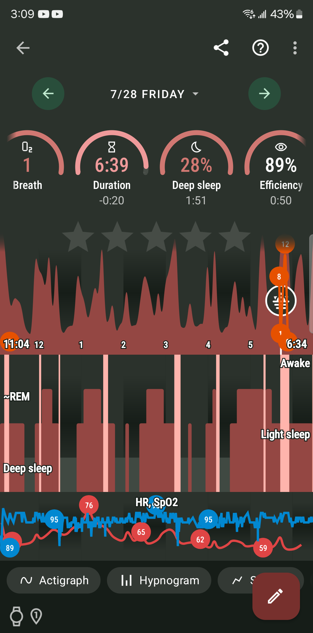
You say the blue line is the SPO2. How on earth is someone who isn’t trained on reading such graphs is going to calculate the SPO2 numbers or average or whatever? Why can’t it be shown Barney style like all other stats? ![]()
![]()
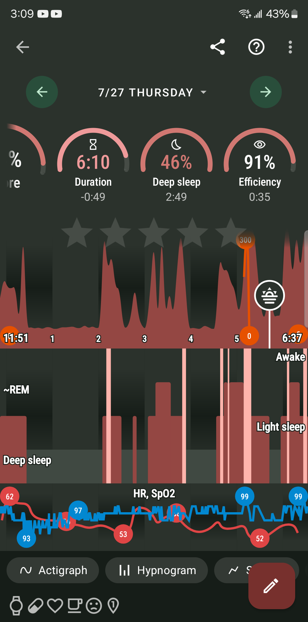
I am confused - the app shows the result of the tracking for each day. Your sleep quality may differ every day, your HR fluctuates, and your SpO2 will not be the same each time.
The graph is derived from the data the sensor provided. If you feel the SpO2 graph is not reflecting reality, you need to check the calibration of the sensor on the device. Sleep app does not alter the data, it shows the data your device sent.
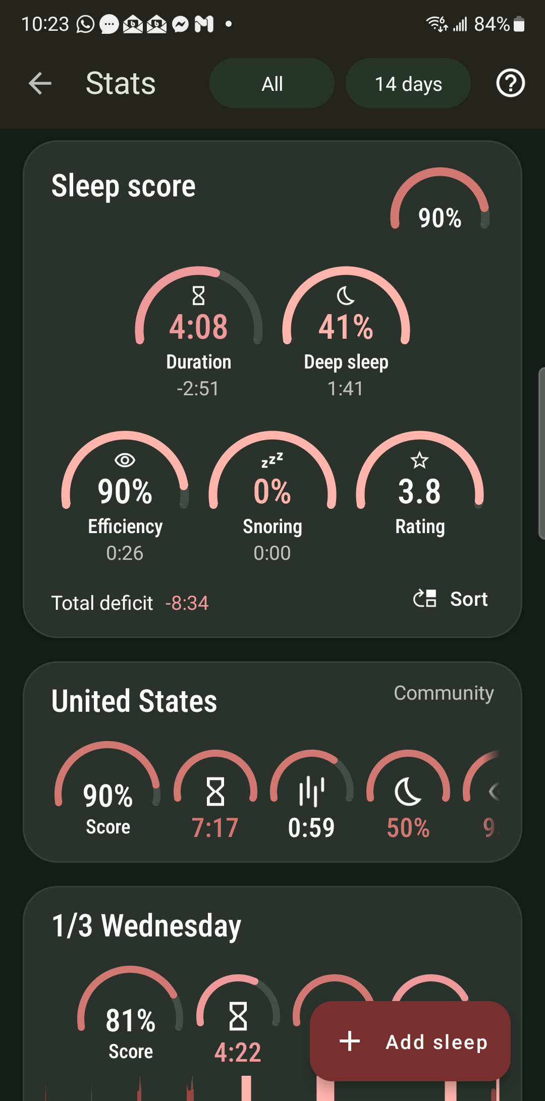
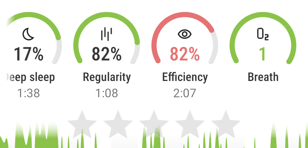
The row of pie charts of sleep score is swipable, it gives the same set of data, but since we show so much data, you see only a section (how much you see depends on your display configuration), but you can move the row to see the rest. The order of the pie charts in the row is adjustable in Settings.
If a pie chart is missing on one graph, it means there was not enough data to render the numbers. Either the data were insufficient, or the sensor for this data type was completely missing.
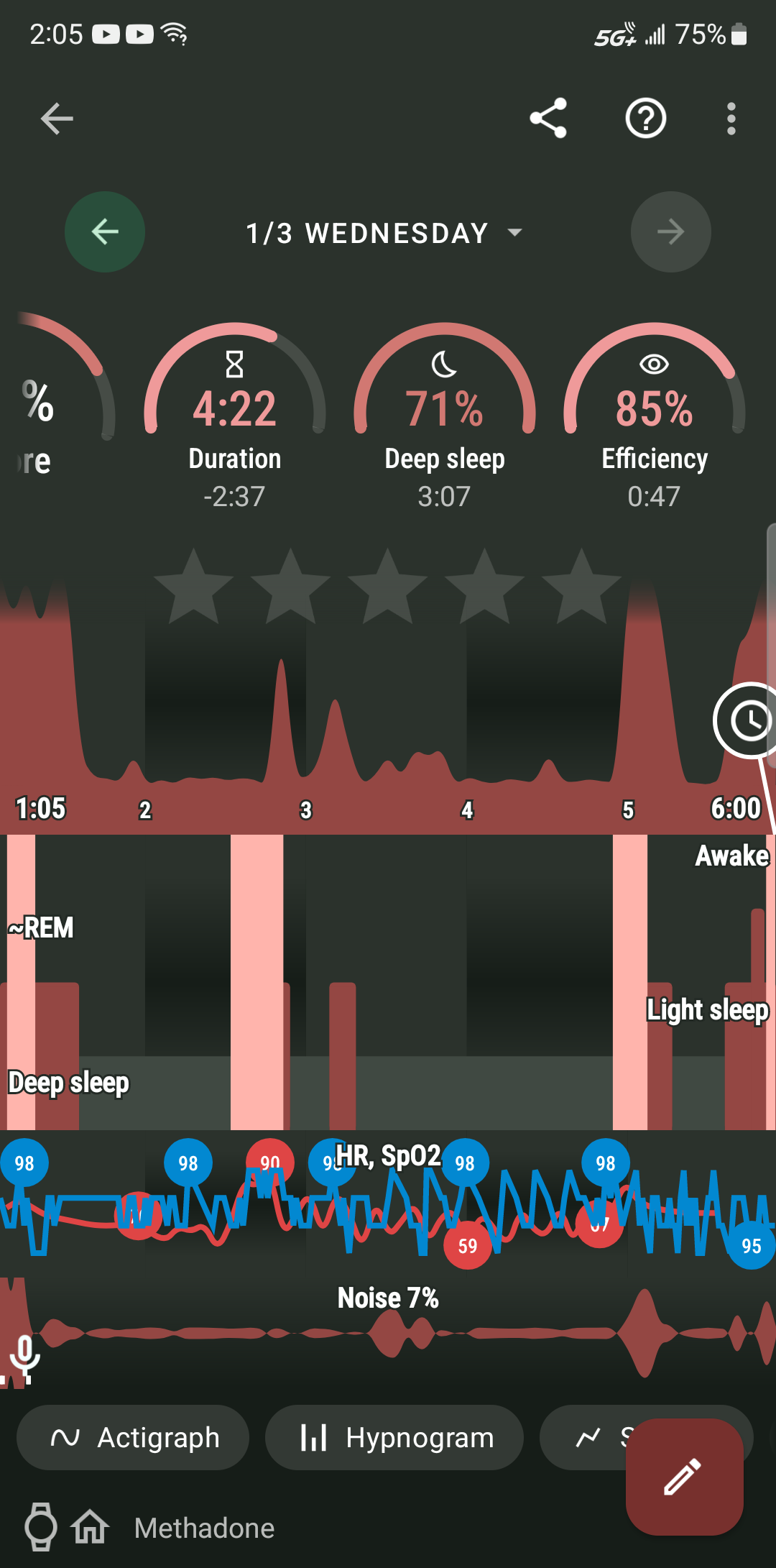
The sensor section of the graph with SpO2 and HR is labeled “HR, SpO2”. We decided to assign red color to HR and blue color to SpO2 - it made the most sense to us.
You can find a quick reference legend in the (?) menu (top right corner) > Legend, where you can find a short explanation of the graph elements. If you need more details, you can also find the “How to read sleep graphs” in the documentation, where every graph element is explained in great detail.
Vako, you can use the free Welleu O2 Insight Pro app to get a single O2 score number for the night as well as a detailed O2 & HR vs time chart as a PDF file. I use that to supplement the summary scores from Sleep as Android for the other sleep data. I hook the ring via the special USB cable that came with it to my desktop computer eachj morning after I get up. I don’t know if this will be of any help to you.
Not an Android app sadly
Hello Vako, this is answered in the other thread you started, the app calculates ODI/RDI, which also shows the number of episodes per hour.
The Sleep graph shows it as the “Breath” pie chart in the sleep score row.
It shows the number of episodes per hour, so the average number of respiratory episodes during the tracking.
Is it different from all other stats? Could you please share with me, which method the other apps use, other than the episodes per hour? We can add a new feature if needed, and if our users would request it.