From Anonymous on 2015/05/12 02:35:13 +0000
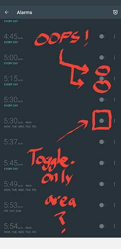
Countless times I reach to activate an alarm only to enter the edit form for an alarm. Please increase the padding on the alarm switch/toggle. If I want to edit the alarm I will more instinctively talk on the schedules alarm time, the blank space in the middle. I do not expect miniscule space around the alarm on or of switch to take me to the alarm edit form.
Copied from original feature request: http://urbandroid.uservoice.com/forums/264867-sleep-as-android/suggestions/7916004-increase-padding-on-alarm-toggle
