I really like the graphics analysis in the
app but I can’t understand why it’s presented from 12h to 12h, why not from 00h to 00h or other ?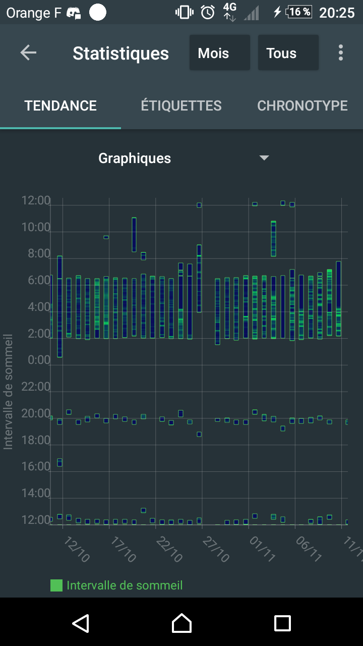
For example, I have a nap at around 12h, so it often appears to be cut between the top and the down of the graph, as you can see in the attached pic.
It would be very nice if we could choose the displayed time range in the app to adapt to each person.