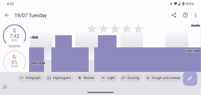
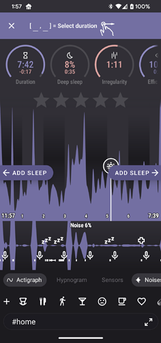
In the current graph view, everything is included and there is no way, on my phone anyway, to get a clear overview of the elements that I am interested in. Currently 1/3rd of the view is taken up by movement data.
My suggestion is that you add a setting where I can select the items that I want to see on the graph.
In my example, I only want to see heart rate and spO2 and maybe the deep sleep graph.
Regards
Eric Kavanagh
Hello Eric @privatekavanagh, my collegue @jiri-urbandroid is just working an a new interactive legend feature where you can toggle different elements in the graphs to get exatcly the view you are looking for… this will appear soon in a BETA version… many thanks for your feedback
Hello @privatekavanagh , this feature is now out. You can toggle any aspect of the graphs together with a new improved landscape view with a single graph…
To get the feature please sign in for a BETA update from the Play Store or install the APK directly from this link:
https://sleep.urbandroid.org/wp-content/uploads/release/sleep-20220720-beta-release.apk
To join BETA, please first join our BETA Testers group at:
https://groups.google.com/forum/#!forum/sleep-as-an-droid
That you can opt-into the BETA at the following address:
https://play.google.com/apps/testing/com.urbandroid.sleep
You can also watch a video here
https://www.youtube.com/shorts/DopEFlKzxSE
Excellent! Works perfectly.
Regards
Eric Kavanagh

