It’s (almost) impossible to read or understand which phases happened at which time. Why isn’t there a normal graph like in all the other sleep tracking apps?
P.S. notify for mi band detects when I fell asleep incorrectly
It’s (almost) impossible to read or understand which phases happened at which time. Why isn’t there a normal graph like in all the other sleep tracking apps?
P.S. notify for mi band detects when I fell asleep incorrectly
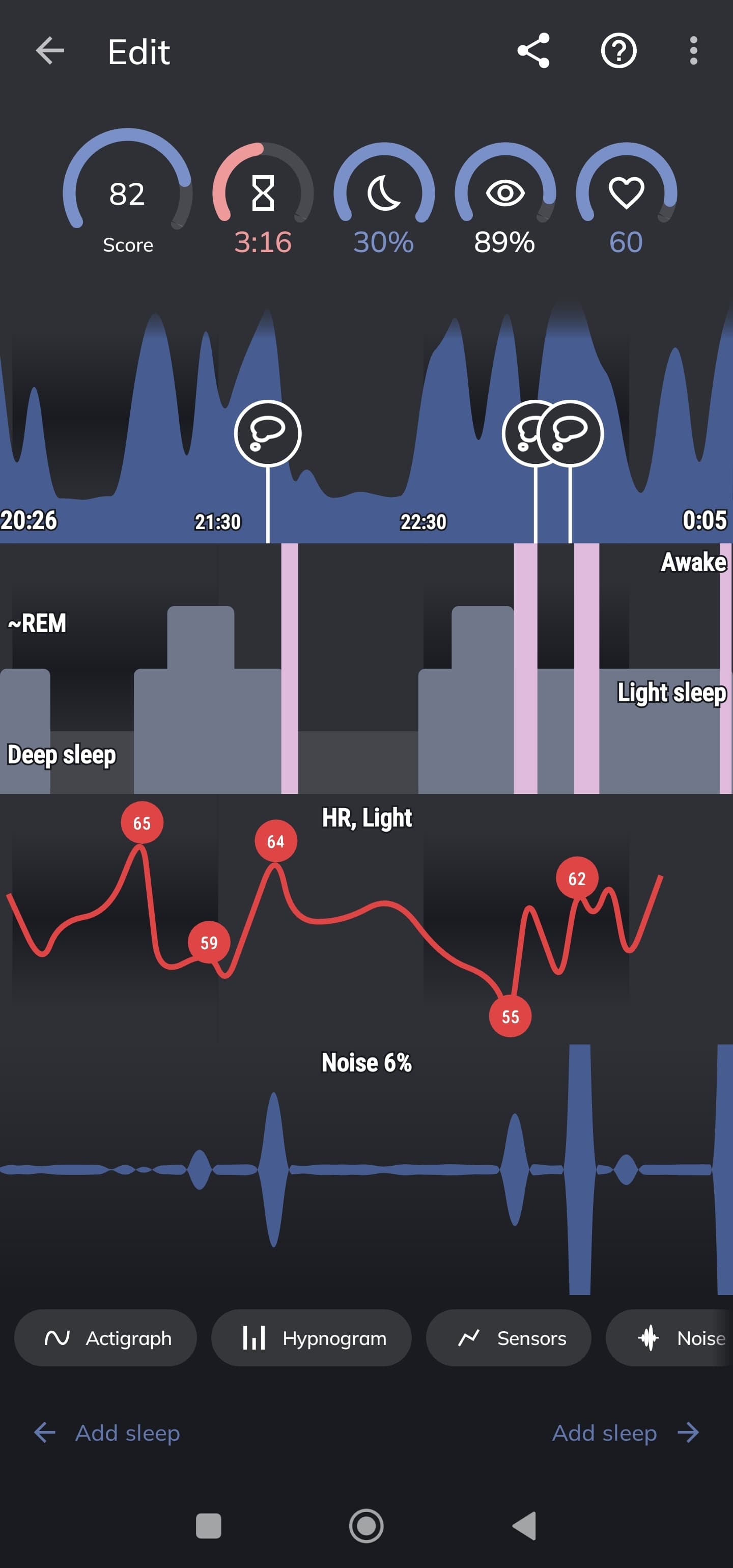
Hi @Sasan, there are two options - Hypnogram and Sleep Phases. We offer both options so users can choose.
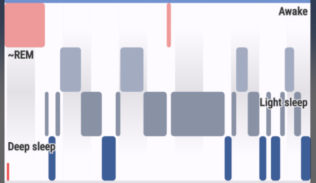
Notify graph from your screenshot uses almost the same column graph type as our hypnogram - using three columns for three sleep phases (we also show awake, so we have 4 column types).
Each column represents one sleep phase in the time, depending on the sleep phase, the color and height differs.
What change would make our graph similar to their?
On your graph from Sleep, you were first in the light sleep, followed by deep sleep (dark grey), followed by light sleep with REM, short awake (pink), followed by deep sleep, light sleep with REM, a short awake followed by light sleep and another awake, and then light sleep till the short awake at the end.
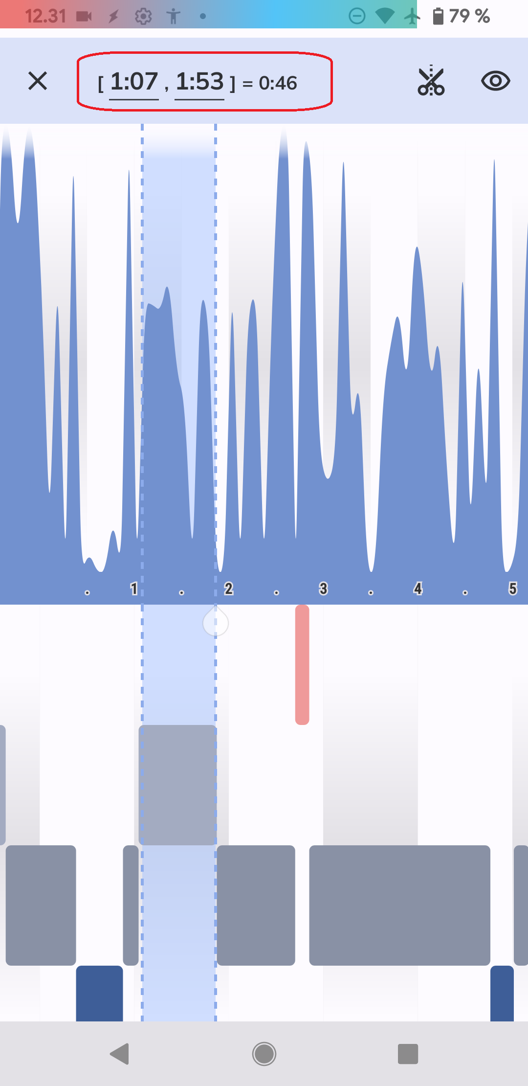
The time stamps are at the actigraphy graph above, the app also shows light shading for each hour for better orientation in time.
In the zoom mode, you can select the period of your interest, and check the exact time stamps (and duration):
Is Sleep Phases graph the one you are looking for?