New update brings us a teryfying design change of analog time picker. Before this update the clock was same as a real clock with hours and minutes. Now the clock layout is unnatural and it’s very user-unfriendly to use it. Please give us back original analog clock layout. Thx!
1 Like
Same here! Google is being retarded and it’s their doing: [TimePicker] More natural 24h hour picker · Issue #1450 · material-components/material-components-android · GitHub
Really, please do revert to the previous “real clock” design. This new one is just surreal on so many levels…
Hello folks,
can anyone please explain me this issue :).. I’m not getting what is so different with the new time picker compared to the old one?.. Please read our official answer to this which we use in the support communication:
Sorry for the issues with the new time picker. In the latest version of Sleep as Android we have enabled the new Material design time picker done by Google. This is the default component which starts to replace the previous one in Google apps and many 3rd party apps in the following months. Please check Time pickers – Material Design 3
The new material design time picker is visually nicer in our opinion but functions and behaves exactly as the previous one, it only does not display the second inner circle of numbers for 24-hour format. I guess this is to make the component look less cluttered. The same spot still reacts to touches so you can setup your times exactly the same way as before just the hint number is missing for even hours. I guess this is similar to some physical watch makers abandoning some numbers - or even all numbers - from their watchfaces to make them look nicer.
Anyway we have heart quite some negative feedback on the new time picker and this is why we are first releasing this as an default OFF option, which can be enabled in Settings > Perzonalization > Material time picker.
To get this updated version of the app you can join the BETA channel for Sleep as Android as follows:
Please first join our BETA Testers group at:
https://groups.google.com/forum/#!forum/sleep-as-an-droid
That you can opt-into the BETA at the following address:
or simply by visiting our Play Store listing and tapping “Join BETA”
If you prefer to return to the old time picker without joining BETA, please enabled Settings > Privacy > Disable experimental features - this will also return the old time picker.
Many thanks for your feedback, and sorry for the issues.
I think I get it.. you mean the problem is the the circle is in fact 24-hour instead of 12-hour in the previous picker right?
I’ll past what I send over support email to make it clearer:
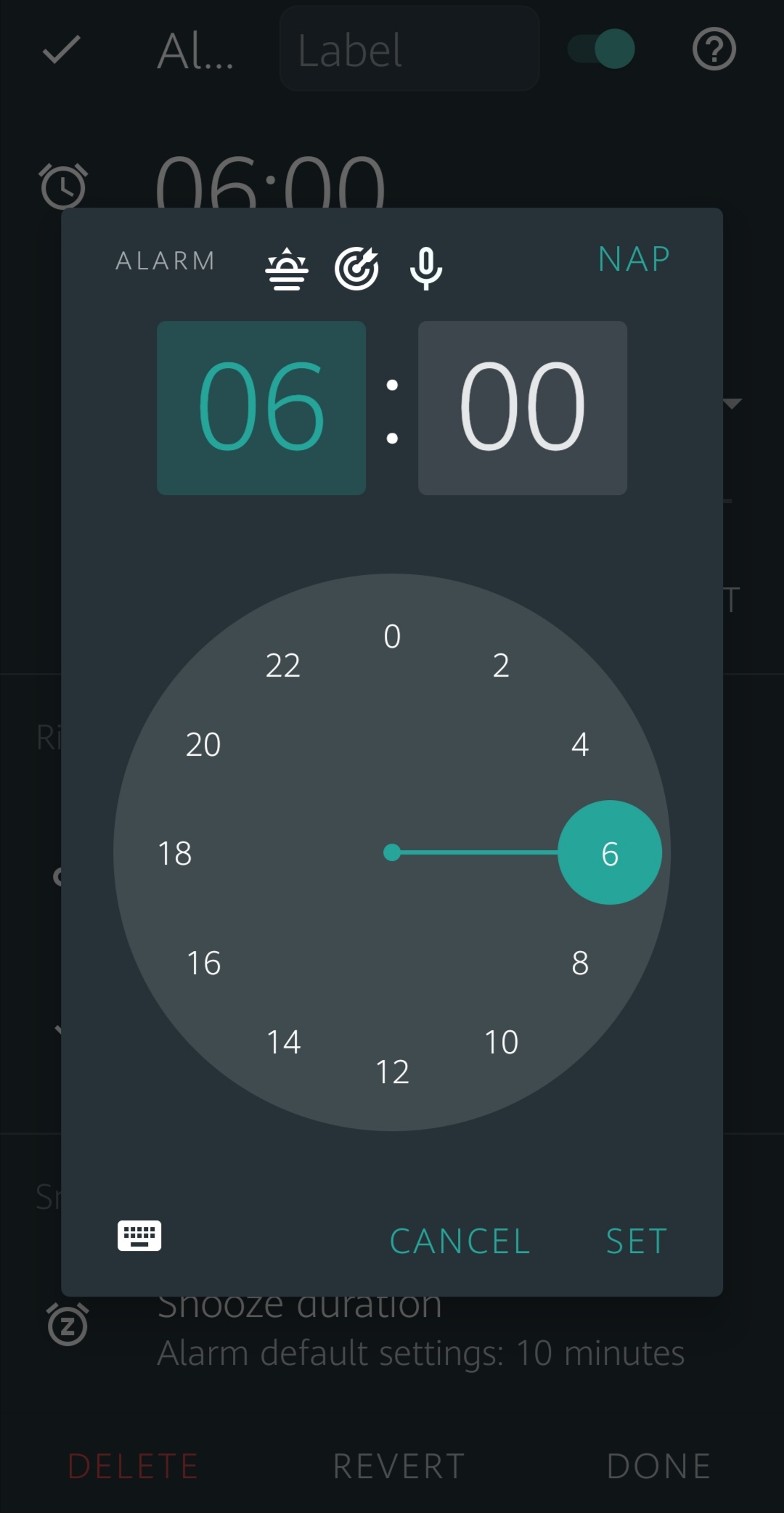
That’s the thing. It indeed looks somewhat nicer (though not that much difference with previous one with the two rings) BUT - it changes how clock is displayed! NEVER EVER you see an hour “18” (i.e. 6pm) on the left (“west” on the compass): https://user-images.githubusercontent.com/284263/86094782-47838200-bab1-11ea-81c3-d57b989725a4.png
18:00 / 6pm is ALWAYS at the bottom (“north”) on all and every clock. For some really retarded reason Google decided that moving it to the “west” position would make some bizarre sense. NO, it doesn’t.
Basically Google is re-inventing something and changes muscle-memory of the whole world (that doesn’t use AM/PM in the system) for… god know what reason…
I would probably be more inclined to use AM/PM time picker (would make more sense “reality”-wise) but given I use Polish locale and all countries/languages I reside/use use 24h this means that SaaD falls back to 24h picker, which is just weird…
Many thanks.. I understand your arguments..
The Material time picker is new and I have checked Google’s Calendar and Clock apps and they still use the old time picker, so I’m curious how the adoption of the new time picker goes for Google and maybe they will face similar feedback and address this in an update of the picker…hopefully..
I see 2 advantages of the new picker and this is why we have adopted it
- it can be better material styled
- the keyboard variant looks much much better
So for now we will stay with the old picker as default and we will see what happens to the new picker in a longer run..Anyone who want to use the new picker can enable it in Settings > Personalization > Material time picker..
Many thanks!
Erm, I think there is still some problem. Currently we have:
- ancient picker (with two sliders, separate for hours and minutes)
- “old” material (round, two rings)
- “new” material (round with eccentric layout)
Currently SaaD uses (3) and disabling option in settings (“material time picker”) would cause to use (1) - correct (that’s my experience after e-mail conversation). Is there really no way to get (2)?
Hello Wojtek, there are two options:
- Analog time picker
- Material time picker
The default option gives 1) ON 2) OFF gives you “old round picker”..
Non default option 1) ON 2) ON gives you the new picker with the issues as above
Making 1) OFF gives your the ancient picker..
To get this behavior you need to update to version 20210524 released today..
Many thanks..
1 Like
Great, after update is all okay. Thank You for fast answer and fast repair. Thanks!
@Lukas many thanks for the feedback, glad to hear that..
Perfect! Works like a charm! Thanks a million ![]()
@wojtek great news.. many thanks..
Just got the latest stable update, and found that the option to confirm my time change was not present. I found it by tilting to landscape, but that was just by luck.
In addition, previously when I just pressed the time of my alarm from the main page, it would only open the time picker. Now, it also opens the full settings of the alarm, with the time picker on top. Not a big issue, but it does add another step to close the app after changing the time of an alarm.
I can’t help thinking this is related to the change in time picker, even if it was reverted.