I find the sleep charts hard to read. I would like to see some changes to make it easier to read.
Hello, thank you for your feedback.
Could you please give us more details?
Which chart is difficult to read? Do you have any specific idea on your mind, what would make it easier to understand?
This is something we would love to improve.
Hello,
I also find the charts hard to read. The information density is quite high when viewing a sleep log, which can make it difficult to see and understand the graphs. Sometimes, lines even overlap each other and hide the numerical values shown on the graph. See the figure below as an example.
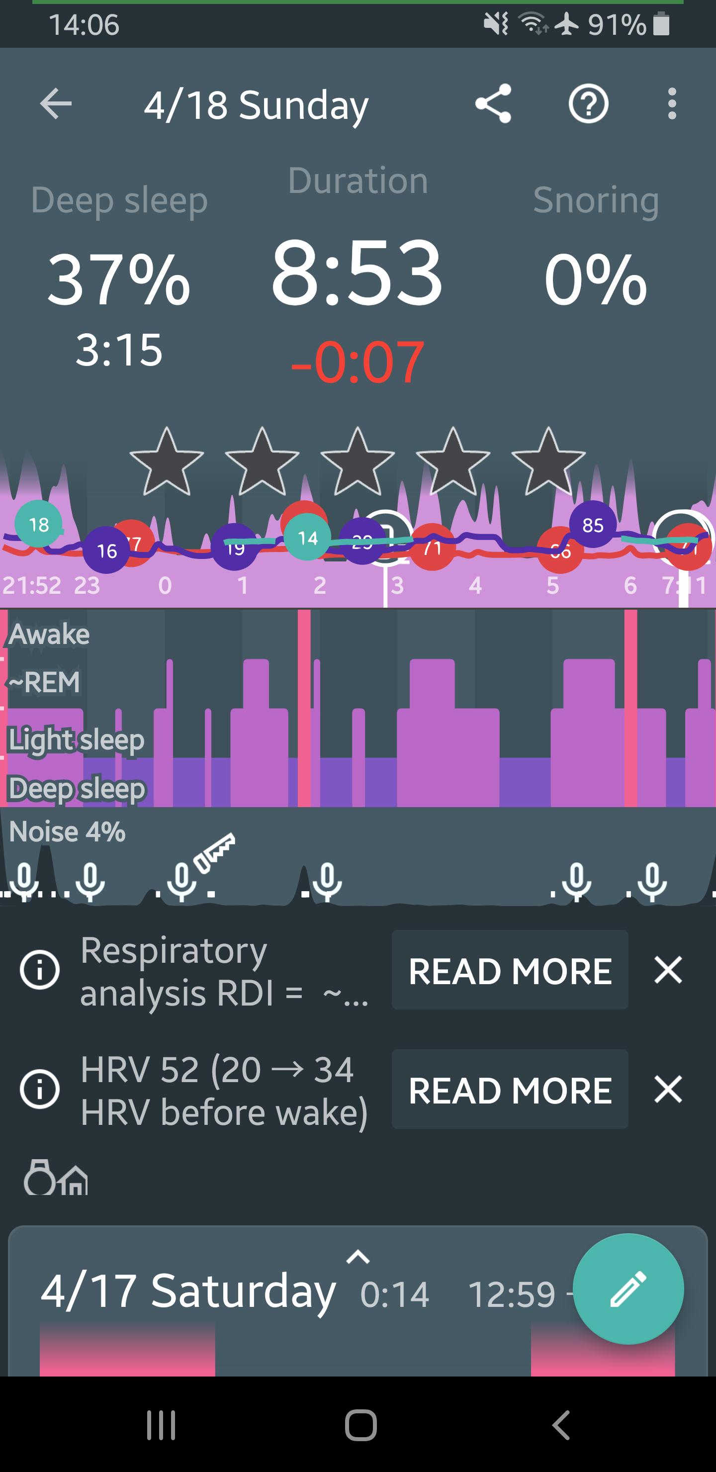
Here are a few ideas that can help:
- Separate the colored lines into multiple graphs; similarly, icons can be separated
- Have the page be a scrollable; not everything needs to be viewable in a single screen
- Ability to hide/show different graphs or items on the screen
- Support for zooming in and panning to navigate a graph more easily
Thanks!
1 Like