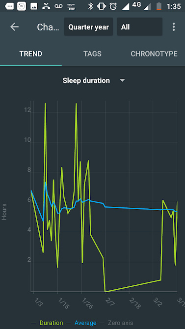
Sometimes I spend a lot of time without tracking my sleeps and than I come back to the app. But, when I god to the charts, there is a big line connecting all the time.
My sugestion is that there’s not such line. It will be good for some reasons:
1- It will not mislead us to think, even unconsciously, that that statistics is growing up or growing down.
2- This will easily remember us that we didn’t have data from that day.
The team can even do a mix of the old way and my suggestion. For small amount of time (a day in a 14-day chart), take the connection.
Another way that could do well is plot the chart with a traced line in this kind of line.