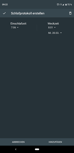
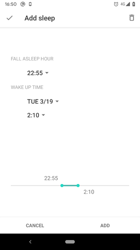
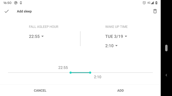
The site to create a sleep log really does not look nice anymore. Could you modernize that a bit?
Yes, better, but can you please seperate time and date? Maybe just 3 single lines with asleep, wake up and date i.e.
and more symmetrically
It´s still hurting, that they stick together 
I understand… but the idea here is to highlight the fact that the date belongs to the wake up timr… putting a day label would break that IMHO…
Ah i understand. But the symetrie from wake up timer and the date.
Is there progress on the way?
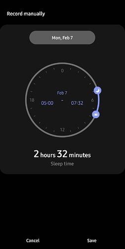
Adding a single nap takes a good minute, compared to near instant results with Samsung health Screenshot_20220207-073234_Sleep|253x500


