hi,
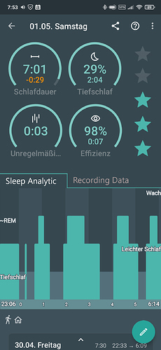
I would prefer the Sleep Screen to be much more simpler. I personally think there is just too much data on one screen for the diagram view. I would especially separate the “Sleep Data” with the “Recording Data”.
I made a suggestion with the image below.
Why not separate the two Data views with a tab?
Happy to know what you think.
