Not every measurement that’s been taken during the night is visible (especially not on phone) so a lowest\highest number for HR, O2, etc. would be very cool😎
…or even better… put your finger in the graph and it shows you the number (or just the part you’ve selected, like selecting ‘sleep to as\remove awake’… There could be the lowest and highest numbers for that selected period there?). Maybe I’m asking alot ![]()
If I open the graphs on my tablet much more measurements are visible…and if I hide actigraph, hypnogram and recordings, the graph stretches out even more.
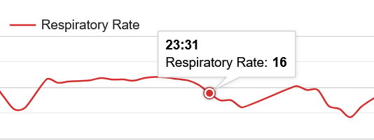
Especially with O2 this would be handy, sometimes there is a dip, but the number shown(little blue dot) is not the lowest measurement of that curve and there are no lines to read the percentage from, so guesswork.
If not possible, maybe a tiny transparent line for every percentage? So not just 5% per line (I miss that in the SleepCloud too, I’m allways guessing what the real numbers would’ve been).
Thank you for your hard work, it’s a great app!