From Davide Corrà (KoRRo) on 2014/11/13 02:32:07 +0000
I don’t need new features, but I’d love a big rework of the interface. Every update makes it more messy.
First of all it would be great to remove all the duplicates, like actions both in the action bar and in the navigation drawer (actions should never be in the navigation drawer) and settings repeated in different menus.
Also a complete redesign following strictly the official design guidelines would be great and would make the app much more usable.
Copied from original feature request: http://urbandroid.uservoice.com/forums/264867-sleep-as-android/suggestions/6709638-interface-redesign-and-simplification
From Petr Nálevka on 2015/03/29 21:16:34 +0000
+Davide many thanks. I do very much appreciate your feedback. Also if you have any specific ideas what we could improve this is appreciated too. I hope the main screens of the app just got cleaner and we would like to continue on this with some other screens. The next I would like to focus on is alarm dialog, graph detail and rating screen…Many thanks
1 Like
From Davide Corrà (KoRRo) on 2015/03/29 20:33:06 +0000
I'm already using the beta and I like the new interface. Both the main interface and the settings are definitely better than when I posted my first comment about it!
1 Like
From Taica Patience on 2015/02/22 17:32:23 +0000
Also on this topic, the icon for this app is so complicated and ugly and hard to grasp. I would love just a simple moon or clock or something. Also the images of an android and chess pieces in the app itself are very ugly and distracting. They have nothing to do with sleep. The moon is great, but the rest are a bother.
From Taica Patience on 2015/02/22 17:27:37 +0000
This is my request as well. The whole interface is so cluttered, difficult and dark. I would like it to be brighter, simpler and more colorful and easy to use. I agree with the other comments and in addition, I would like the tags to be in a vertical list with a radio button I could press or undress (and the ability to delete the ones I don't use), all having text wtih the icons as I forget what the icons mean when I am half asleep. I wouldld also like to not have to have hash tags on them all. For an example of many of these things see the app "sleep cycle" with the orange alarm clock icon. I chose yours instead only because it is more comprehensive, but their interface is SO much more pleasing and easy to use on many levels! I also would like the ability to select tags about the day'sactivitytes before I go to sleep (like exercized, coffee etc) as I am more awake and have more time then. I then would like to be able to add tags related to my sleep itself once I wake up.
From 徐旻吟 on 2015/02/08 14:32:02 +0000
睡眠時必需將手機放枕邊,作睡眠追蹤~請問若是關成飛行模式,是否就沒有幅射的問題?
From David Clark on 2015/01/11 15:13:52 +0000
As a beginner user, I agree with the comments that the interface could be improved, particularly for readability. For example, I find it hard to pick out some numbers because they are so small or faint. A huge example are the axis labels, like the dates at the bottom of many graphs. They are tiny! Vertical axis labels are equally hard to read, like number of hours.
Also, I'm wondering if your color scheme is consistent. In the documentation on How It Works you say deep sleep is green, and light sleep is blue. But on the Tag screen under Charts the Deep Sleep % is blue.
Finally, I find your navigation non-standard and hard to follow. The Stop arrow on the Sleep Tracking screen is slid to the right to stop tracking? Really? I don't think I've ever seen an app on Android or PC where an arrow was meant to be moved; it's always a pointer.
You have an excellent app that I hope can be very helpful to a serious insomniac like me, but I'm having trouble making a go of it.
Thanks!
From Pascal Brennecke on 2015/01/07 11:31:12 +0000
I like to have a feature that shows you the To Do List / opens Google Calender after turn of the alarm.
To make Sleep as Android look a bit tidier, it askes you every week / month to erease unused alarms from the list. 
From Andy Bryant on 2014/12/10 11:32:22 +0000
After wake I'd like to see the check-mark accept button on the lower right hand corner (as the new message buttons in recent material design google apps such as gmail and inbox) to make it easier to get to with one hand on larger devices.
From Jeremy A on 2014/12/04 06:10:27 +0000
I'd like to see a more seamless integration with Twilight --perhaps even embedded in this app, instead of using two apps. Setting up the two to work together is more tedious than necessary.
From Ben Milford on 2014/11/26 20:02:49 +0000
Please, please work on this. I have a really hard time navigating the application.
From Olaf Marzocchi on 2014/11/22 17:19:29 +0000
My suggestions:
- the screen appearing with the alarm is overcrowded and if I'm sleepy I can easily tap the wrong button, the same applies to the one immediately following: the buttons to confirm and delete the past night are fae too close
- the screen where I'm listening to a recording of the night has the graph with variable amplitude and no scale: thee should be a rough indication of the decibels, so that I see immediately if the different amplitudes are close to the minum or if there is actually something. Also, the graph of the amplitude is wider than the bar used to move the selector: if I want to jump quickly to a position I cannot place the slider directly below the peak, I have to guess; graph and slider bar should be equally wide (meaning you have space on the left for the decibel scale)
- after few days the list of recordings grows a lot, even with auto-deletion. That list should list the days and, by clicking on the day, list the recordings. Since we sleep usually from one day to the following one, you can group them by sleep session. In the grouped view, show the date and the number of starred items and (only if different) the total number of recordings between round brackets. Example: "Sat 22/11 to Sun 23/11: 7 starred, 1 tagged (10 total)"
- after a while, even with grouping, the list becomes long. You may additionally group by month after 6 months.
- as in other apps (Facebook), tapping on the tab currently active (like the recordings tab) should bring you to the top of the list
- similar reasoning for the list of sleep nights (second tab I think)
UNDERSTANDING STATS
Greetings, I’m new to the form, so I just want to thank you for all of the hard work on this app, and what looks to be good continuing support. I have a few feedback items I’d like to share, as someone who used to have an iPhone and use Sleep Cycle.
When using Sleep Cycle, I felt like I was more in tune with my sleep stats, add that’s something I miss. When finishing a session I would like to be taken to my stats, because that’s ultimately what I’m using this for and the first thing I’m interested in every morning. Also, I must admit, I can see how the iconic Sleep as Android bar graph might seem more legible and logical than seeing a squiggly line graph, but to be honest this was originally much less intuitive to me. And even now it feels as though I’m getting less information. Could there be an option to prefer a line graph be the default instead of the bar graph? Or to see them overlaid or something?
BAR STATS
When I go to my bar stats tab, I don’t really need to see every bar graph lined up on top of each other. That doesn’t tell me much. I wish I could collapse these graphs and more visual priority was given to comparing duration and quality of sleep from night to night. And perhaps a line graph showing me how my sleep patterns are charting (duration and quality) over time. That would interesting!
HASHTAGS
When looking to hashtag stats, again I’m interested to know how each one affects duration and quality of sleep. I’d like to be able to understand that at a glance. Right now when I go to that stats tab, I just see a bunch of numbers. I have no idea how many samplings of that particular hashtag are involved in these results. I’d like to be able to say, “#tobedearly seems to be associated with better quality sleep? That’s interesting. But is that based on a sampling of 5× or 50× or 500×?” Also, this would actually even a great place to perhaps have some colored bars under each tag that gives a visual 0-100% rating on how this affects my sleep quality and duration.
SUMMARY
I’d like to see stats take a more central role in the app. I’m interested to see how things affect my quality and duration of sleep, I’d like to see how my sleep is evolving over time, and I’d like that information to be easily accessible and able to be read at a glance QUALITATIVELY. It doesn’t need to be a detailed duplication of my nightly bar graph, instead something that aggregates relevant information and helps me understand it in relation to a big picture. Thank you much!
SESSION SCREEN
Regarding the screen that comes up once I start a session, there’s a ton of information displayed when I begin a session. I can see how it would be good to know the status of alarms. But this could be accomplished with a more clean graphic and less text.
On night 1 after clicking the sleep button I was anticipating a simple screen with a large-clear alarm clock. I was surprised to be met by an overwhelmingly long list of fine print. Every night after night 1, I don’t read this fine print, but it just appears as clutter on my screen. I don’t think it needs to be there. Besides alarm info, the rest could be available outside of the sleep session.
PAUSE BUTTON
I really LOVE that you’ve added a pause feature! Thank you for doing this. As someone who wakes up frequently, I use this feature alot. The thing I would request is that this button be mad emuch more accessible. When fumbling at 2:00am I can rarely pause successfully on the first try. The button is tiny and on the far end of my screen. When laying down and looking at it from down the long screen of my S8, the distance is hard to judge. I often miss, or (because of the delay) I THINK I missed Ed and therefore punch it twice and cancel myself out. In my opinion, the pause button could be huge and should be on the microphone end of the screen (like it could be the whole bottom half of the screen as far as I’m concerned) so that I don’t have to feel like I’m “reaching over other stuff” to find it.
ALARM CLOCK SCREEN SAVER
I won’t say much about this. I appreciate that it moves to prevent burn-in. But in my opinion it could be bigger and could include at-a-glance alarm info (weather info?). Also it would be nice if there were a button to manually activate this alarm clock screen saver.
Thank you for your time, for your hard work, and for considering this feedback.
Now, the day after posting my feedback on stats, I discovered the “Charts” section which appears to contain much of the information I’m looking for! So I apologize for speaking in ignorance. I guess the only thing I would say here is that the GUI does not place much heirarchy on these charts (I’ve been using the app for 3 weeks and just noticed the subtle little “Charts” button for the first time today). In my humble opinion, linking to this information could benefit from receiving greater priority. I would like to see the option to link directly to my favorite charts as I’m finishing a session. That said, there also appears to be (at first glance) quite a thorough accumulation of graphs. Probably more than I had with Sleep Cycle. So that’s certainly not a bad thing. But I did feel like Sleep Cycles simplicity made the primary graphical information easier to find, access and the graphs were visually easier to understand (from my first impression). I like having all the graphs available on Sleep as Android, but could there possibly be a way to, not only give “Charts” greater heirarchy and easier access, but also to perhaps “pin” favorite charts, in such a way that it clears out the clutter that one doesn’t care to see on a regular basis but that the app gives more priority to connecting you with the charts you care to check regularily?
SUMMARY
Basically I think I’m asking for a shift in focus of prioritizing information such that one can more easily access and understand how their sleep patterns are affected or evolving on an aggregate-big-picture level.
I hope this feedback is helpful. Again, I’m thankful for the app. Appreciate all that’s been done. Thank you for the hard work!
Sleep Cloud does this extremely well. You can check on the correlation of any two stats very easily.
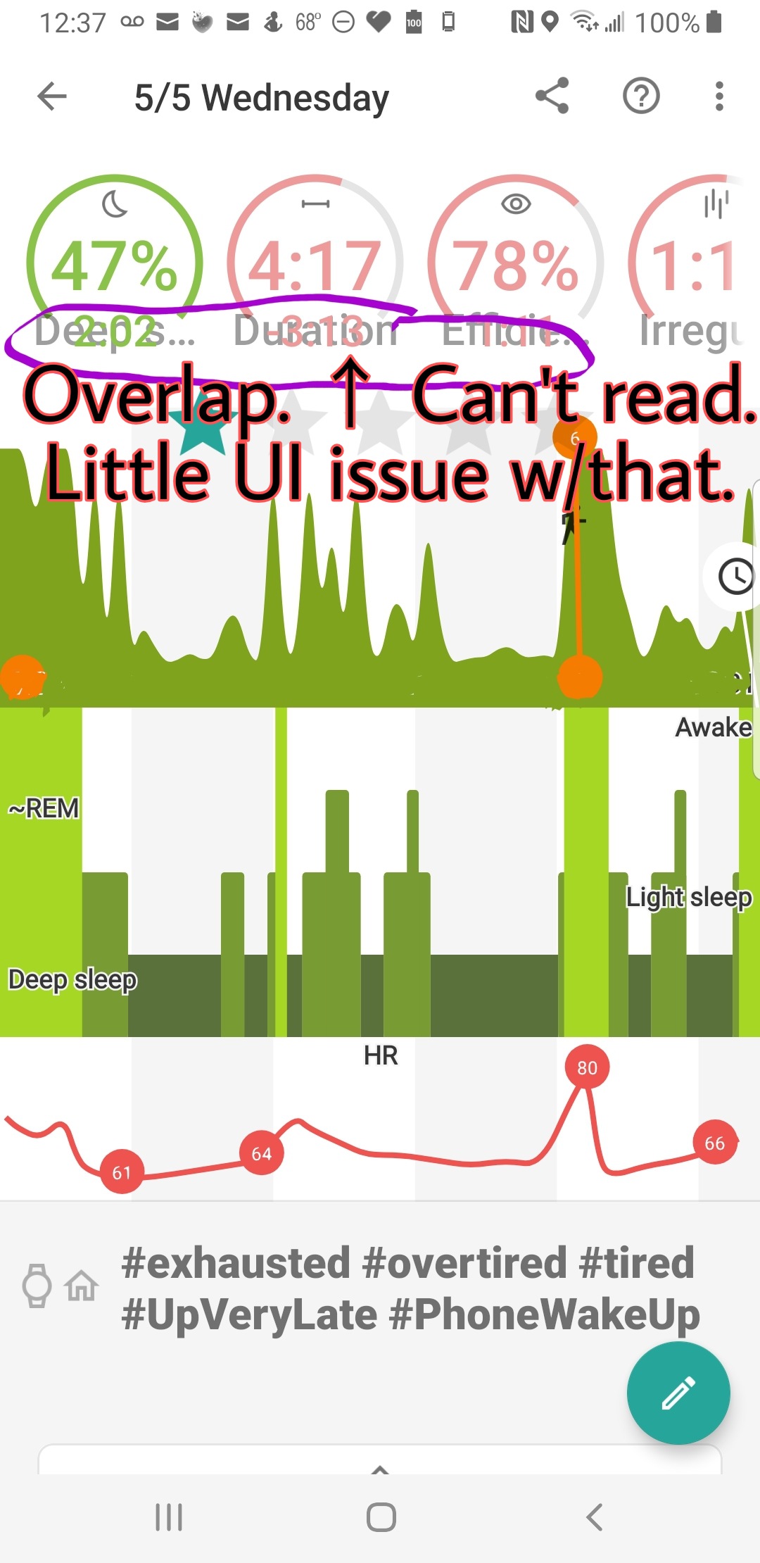
The only problem I have is in the screenshot below. There’s an overlap that makes it very hard or even impossible to read. I know you’re working very hard on it and that it’s a work in progress. But readability is important and could go to the top of the list of tweaks to-do.
Also, in duration, there are two different numbers; I assume the lower number is with “awake” extracted. If that could be made more clear, it would be easier to show the app to friends who are thinking about getting the app (and paying for the unlock). It’s a little difficult to show it off if they can’t read what’s there. I know it’s only temporary and that you’re still working on it but they don’t. It’s probably easier to read on a tablet. But I don’t have an Android tablet.
The fix is quite simple, actually. Put the label “Deep Sleep,” for instance, ABOVE the circle, rather than over the number. Just make the font a little smaller for the label, and move it above the circle. “Duration,” etc.
Thanks,
Robin
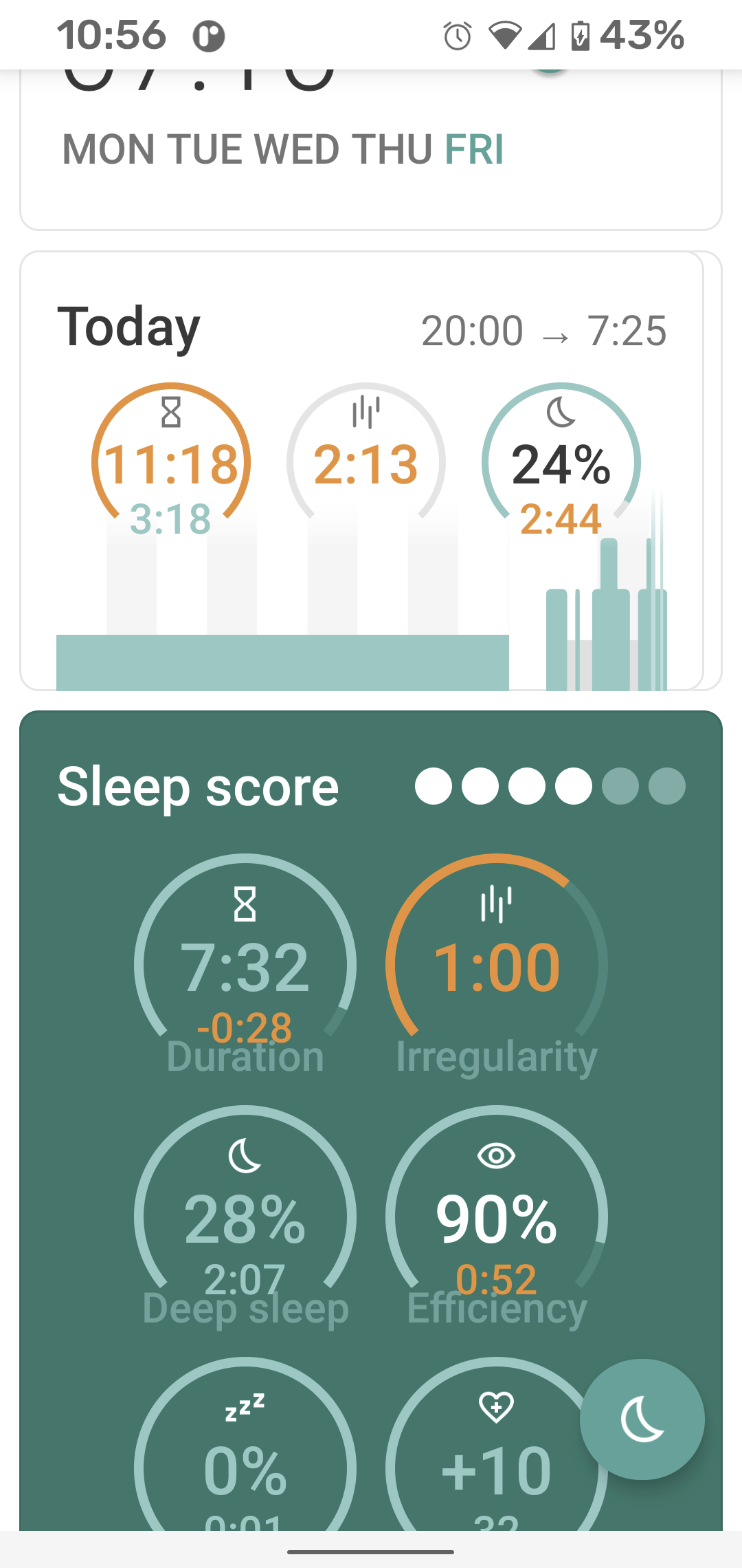
Hello @Robin_Markowitz… big sorry for the rendering issues… I think this must be some specific DPI settings on that device?
If try to reproduce this on my device (Pixel 4) and I set the largest font possible and Larges display size… the result is in the screenshot below…
If I would be preparing some experimental APK for you would you give me some screenshots back as at the moment I do not have a device where I could reproduce this… Many thanks…
1 Like
Hello @Jonny_Vliet, if you tap on on any of the Sleep Score measure it will take you to the relevant Chart for it… so tapping on the your Duration pie view in the graph detail takes you to the duration time chart… The same for the Stats screen…
More over on the Dashboard there is a chart card… you can slide through the charts, tapping on the chart will take you to the full chart in the Charts screen… Exactly as you say the last chart you use is pinned on the Dashboard so that you can always see how is the most important measure developing…
Hope that helps…
Sure! And it’s a big phone being a Note and all. Not as big as the Note 10 Plus, Note 20 Ultra, but plenty big. I am considering a possible trade-in for the Note 9, because it’s just a refinement of the Note 8. Perhaps when I get the money to do so. They’re cheap - for contemporary phones, which is still very expensive.
I don’t remember if I hit “fill entire screen,” which kind of stretches everything. But I think I did. During that day when Google’s “Web View” crashed every app, I thought at first it was just me and got so frustrated that I factory reset my phone. Seems upgraded now even though they stopped upgrading it officially. It is noticeably different (in good ways).
And yes it wiped out many legacy apps, but I have the mirror site for the Pebble-Rebble app and it worked perfectly.
(Google should back down and let it in the Play Store again, though - they are selling new watches on Amazon right now and they fly out whenever they’re in stock.)
But I lost my old Sleepmeter diary. (It’s a pure statistical diary, not a tracker. More statistics than anyone could imagine! I miss his dry humor. Oh well.) Gone with the wind . . .
So, yes, I will try it. 
Many thanks,
Robin
Hello @Robin_Markowitz, yesterday I did a blind attempt to get some more pixels to to see if that helps so if you would be so kind and send me another screenshot that would be great.
Also I’m not familiar with the with the “fill entire screen” feature and I think you my have found the cause of the problem as the test sizes on the screenshot are so big this would IMHO never happen with normal DPI scaling. Would you pleasse just try to disable that feature a for a moment and let me know what that does to the issue?
Big thanks and all the best!
Petr
1 Like