Hi everyone! We would really appreciate if you could give us feedback on the new dashboard layout. What you like, what you hate, what you’d do better.
Thanks a lot!
Hi everyone! We would really appreciate if you could give us feedback on the new dashboard layout. What you like, what you hate, what you’d do better.
Thanks a lot!
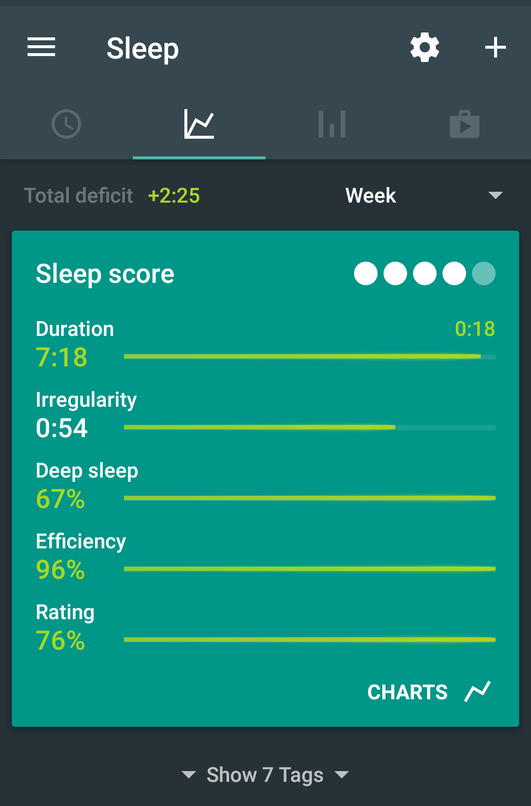
I really like the app. If I were to make a suggestion it would be to adjust the language and icons regarding charts, graphs, and accelerometer recording. They seem a bit conflated and the icons imply different things (a line chart on tab 2 doesn’t result in line charts in tab 2). The 3rd tab looks very similar to the 2nd tab and I don’t usually use tab 3 as I find tab 2 is easier to read. I would suggest that the 3rd tab be the charts (perhaps called “analysis”) and have the line chart icon and tab 2 have the bar chart icon. Although, because tab 2 is a list of the accelerometer data, a custom icon that looks like accelerometer data would be more clear than the stock bar chart icon.
Hi yake - thanks a lot for your suggestions, great ideas in there. We’ll definitely take some inspiration.
However, please let’s keep this thread related to the new layout - Dashboard, not the old tabbed layout.
Issue: As a user, I want to find the overview/list of recordings, once I tap the widget that shows sleep recordings. If I the tap on one specific list entry, I expect to see the respective recording with all detail (drill down).
Ux funfact: If you would adjust the file as described, the “bar chart icon” becomes obsolete. The widget indicates the overview, the single entries indicate the drill down. And the Android “Back” brings you to the overview. No additional navigation elements needed.
Update: I learned from Jiri, that instead of a list, swiping the graph card brings me to previous recordings. For me, this does not solve the issue of not being able to compare graphs visually.
In addition: It helps to indicate functionalities in interface elements that are new to your users, such as swiping in one or the other direction. I simply did not even try this since there was no visual hint, or behauviour.
Good look woth your redesign,
Anke
Hi @jiri-urbandroid. Maybe I’m not sure what you mean by dashboard layout. What I was describing was from the image below, release 20180518 BETA. Is the dashboard something else?
I’ve played a bit with it and it’s not that handy:
While with strong suggestion to use dashboard instead of tabs it could be helpful if I adjusted my habits and following were incorporated: